


Claiming the roots and history of a town and honouring its ancestors is the best way to show its essence and identity. With these premises in mind, the Councillorship of Tourism, with Víctor Bisquert in charge, has configured the new Benitatxell tourist brand “Respira Mediterrani” (Breathe Mediterranean). It is an ode to the historical and ethnological patrimony, the work of the land and the Mediterranean essence that wants to escape from the mass tourism model of sun and beach and promote respect for the local population.
After almost 20 years with a brand that only focused its image on the coastal part of the town, it has decided to go for a new aesthetic that represents the different characteristic elements of the town, with special attention to its past and its agricultural tradition, where the terraces of muscatel, the dry stone and the riuraus were the characteristic elements of its landscapes. ‘Respira Mediterrani’ is also about understanding the rich essence of Mediterranean towns, with the characteristic blue of the sea, a formidable way of life, a rich gastronomy and a characteristic architecture.
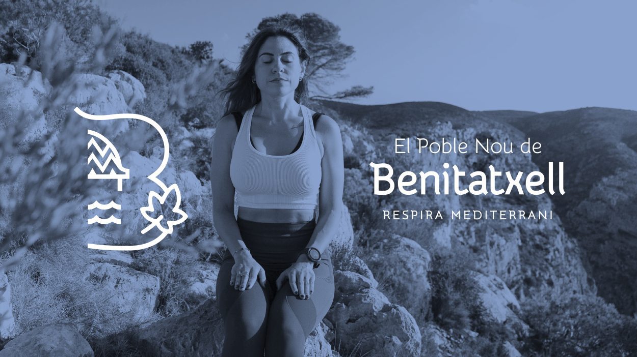
In the same way, as Bisquert recalled, the brand is linked to the values already promoted with the ‘Tourism to breathe’ campaign, consisting of a slow, calm and relaxed tourism with values such as taking care of the environment, the local traditions, the language and the lifestyle of the pobleros and pobleras.
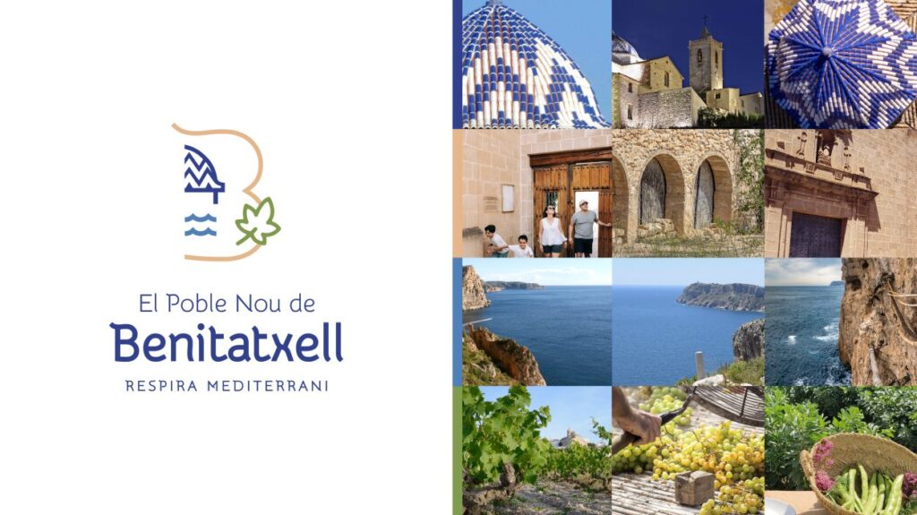
All these values are represented in the main logo of the brand, which brings together different elements that can be interpreted from many angles. On the one hand, the outline of the dome of Santa Maria Magdalena church stands out, the central point of the municipality that can be seen from all areas and is configured as a characteristic element. There is also a leaf, which represents the agricultural identity and emulates a branch of the muscatel grape.
On the other hand, the waves represent the sea and the maritime culture of the municipality, with the ‘pesqueres’, the caves and the old fishermen’s cottages, etc., while the profile of the letter B, as well as referring to Benitatxell, evokes the arches of a riurau or the curved shapes of the terraces. Likewise, the earthy colour imitates the rough stone and earth, and the corner of the letter B the Llebeig wind characteristic of the municipality.
All these elements and colours have been conceptualised thanks to various surveys carried out in the town in which people were asked about the items and colours that they identified with El Poble Nou de Benitatxell. In addition, the rebranding is part of one of the actions included in the Strategic Tourism Plan, the roadmap to achieve a change of model towards a green, sustainable and environmentally friendly tourism.
")
")
")